

Statistics is a branch of mathematics that deals with collecting, analyzing, interpreting, and visualizing empirical data. There are two major areas of statistics: descriptive statistics and inferential statistics. Statistics in general helps answering two questions:
- What has happened?
- What to expect?
Descriptive statistics are used to describe the properties of sample and population data (i.e., what has happened) It involves calculating numeric summaries (i.e., Mean, Mode, Median, Variance, etc..) and creating descriptive plots (i.e., Histograms, Bar plots, Boxplots, etc..).
Inferential statistics, on the other hand, use statistical properties to test hypotheses, reach conclusions, and make predictions (i.e., what can you expect).
Statistics is a fundamental component of data analytics and machine learning. It plays a critical role in analyzing and visualizing data, which allows us to discover insights that we would not otherwise see. By combining Statistics and Machine Learning, we can make more informed decisions and predictions based on data.
"Statistics is the grammar of science." -Karl Pearson
In this article, we will provide you with a comprehensive overview of the essential concepts in statistics for machine learning. You will learn some of the most interesting concepts in statistics that can be used to improve your machine learning workflow.
 |
| Standard machine learning project workflow |
The workflow diagram illustrated above depict the most common steps among Machine Learning and Data Science projects.
Usually, there are 3 main phases; The first phase focuses on the Data, from ingesting the data from different sources all the way to preprocessing it to make it ready for training a machine learning model. The second phase deals with the training and evaluation of ML models, and the final phase generally includes the communication of results, and the deployment of the trained model.
The steps outlined in orange in the diagram are the main stages in a typical machine learning (ML) project that involves using statistical methods. It's evident from the diagram that statistics plays a crucial role in every stage, from "Data Preparation" to "Communicating Results." In the following sections, we will discuss the different statistical concepts commonly used in each of these steps and provide clear examples to help you better understand their applications in machine learning.
Basic statistical concepts for machine learning
To better understand the statistical concepts that we will show in the following sections of this article, we will use only one simple dataset. This is intended to help you focus on the statistical tools used and avoid any confusion that may be caused by changing datasets in each example.Dataset description:
- Name: Iris Data Set
This data sets consists of 3 different types of irises’ (Setosa, Versicolour, and Virginica) petal and sepal length, stored in a 150x4 numpy.ndarray
The rows being the samples and the feature columns being: Sepal Length, Sepal Width, Petal Length and Petal Width. - Application: This dataset is used as an entry example for classification problems in machine learning. Where the goal is to predict the class of a certain iris flower using only its petal and sepal features.
# Import libraries
import pandas as pd
import numpy as np
from sklearn.datasets import load_iris


# Load the iris dataset
iris = load_iris()


# Convert the dataset from an ndarray to a dataframe
dataset = pd.DataFrame(data= np.c_[iris['data'], iris['target']], columns= iris['feature_names'] + ['target'])
The first 10 observations of the iris dataset are shown below:

Measures of Central Tendency
These are summary statistics that represent the center point or typical value of a dataset. The mean is the arithmetic average of a set of data, while the median is the middle value of a set of data when arranged in order. The mode is the value that appears most frequently in a set of data. These measures help us understand the typical or average value of a set of data and are essential for understanding the properties of a dataset.
Mean:
The mean is a measure that represents the arithmetic average of a set of data. It is calculated by summing all the values in the dataset and dividing by the number of data points.
Math expression:
$$\bar X = \mu= \dfrac{\sum_{i=0}^N x_i}{N},\quad x_i:\text{ith observation},\ N: \text{nbr of observations}$$
We’ll mention the mathematical formulas for the different statistics that we’re presenting, however, no mathematical proof or manual execution will be presented since they are out of the scope of this article.
However, the python code used to perform the computations of the statistics will be presented, as shown in the code box below.
Note: The code used to print out the results, and any repetition will be omitted in the subsequent code blocks, to make the article more concise. The full code can be found in Jupyter notebook linked at the end of this post.
# There are different ways to calculate statistics in python, but we will only mention the simplest method for each case.

# Calculate the mean of each feature column
sepal_length_mean = dataset["sepal length (cm)"].mean()
sepal_width_mean = dataset["sepal width (cm)"].mean()
petal_length_mean = dataset["petal length (cm)"].mean()
petal_width_mean = dataset["petal width (cm)"].mean()

# Henceforth, repeated calculations will be omitted

# Print the results
print("The mean of each feature column are the following:\n")
print(f"Mean of sepal length (cm): {sepal_length_mean}")
print(f"Mean of sepal width (cm): {sepal_width_mean}")
print(f"Mean of petal length (cm): {petal_length_mean}")
print(f"Mean of petal width (cm): {petal_width_mean}")
Output:

Median:
The median is a measure that represents the middle value of a set of data when arranged in order. It is less sensitive to extreme values than the mean and is often used to describe the typical value of a dataset.
# Calculate the median of each feature column
sepal_length_median = dataset["sepal length (cm)"].median()
Output:

Mode:
The statistical mode is the value that appears most frequently in a dataset, and can be calculated for both discrete and continuous data. However, it is important to note that the mode may not always be a representative measure of the central tendency, especially when the dataset is skewed or has multiple modes.
# Calculate the mode of each feature column
sepal_length_mode = dataset["sepal length (cm)"].mode()
Output:

Calculating numerical values of these statistics is a step towards better understanding the data and helps us make a clear idea about the distribution of each feature values. Understanding the dataset at hand is a crucial in every data science and machine learning project and that is exactly the aim of the the EDA stage.
Although, numerical values are very helpful, but we usually need visuals to better understand these statistics, and that’s why we use data visualization which can be considered a part of Descriptive Statistics. For example, we can use Histograms, as shown below, to visualize the distribution of the numerical variables present in the Iris dataset.

Measures of Dispersion
In this paragraph, we’re going to present the statistical tools used to describe the spread or variability of a data set. They provide insights into how much the individual data points deviate from the central tendency. The most common measures of dispersion include the range, variance, standard deviation, and interquartile range. These measures can be useful for identifying outliers, detecting patterns, and making decisions based on the level of variation in a dataset.
Range:
The statistical range is the size of the smallest interval which contains all the data and provides an indication of statistical dispersion. Since it only depends on two of the observations (i.e. Max and Min), it is most useful in representing the dispersion of small data sets.
# Calculate the range of each feature column
sepal_length_range = dataset["sepal length (cm)"].max()-dataset["sepal length (cm)"].min()
Output:

Interquartile Range
The interquartile range (IQR) is another range measurements, and it is also a statistical metric that helps assess the variability or spread in a dataset. To calculate IQR, we find the difference between the 75th percentile (Q3) and the 25th percentile (Q1) of the data. IQR represents the range of the middle 50% of the data and is less influenced by outliers or extreme values than other spread measures like standard deviation or range. IQR is a valuable tool to detect skewness or outliers in the data and create box plots to visualize the data distribution.
# Calculate the interquartile range of each feature column
sepal_length_iqr = IQR(dataset["sepal length (cm)"])
Output:

Variance & Standard deviation
Statistical variance and standard deviation are the main measures of the spread or dispersion of a set of data. The variance is a numerical measure that quantifies how spread out a set of data is from its average or mean value The standard deviation is the square root of the variance. These measures provide information about how tightly or loosely the data is clustered around the mean.
A high variance or standard deviation indicates that the data points are widely dispersed, while a low variance or standard deviation suggests that the data points are closely packed around the mean. Both measures are important in statistical analysis as they help to identify the distribution of the data, detect the presence of outliers, and estimate the probability of certain outcomes. The standard deviation is often preferred to variance because it is expressed in the same units as the original data and is more intuitive to interpret.
Math expression:
$$ \text{Var}(X)=\sigma^2= \dfrac{\sum_{i=0}^N (x_i-\mu)^2}{N},\quad s=\sigma=\sqrt{(\text{Var}(X)}$$
# Calculate the variance of each feature column
sepal_length_var = dataset["sepal length (cm)"].var()
Output:

Although we used the mathematical formula to calculate the standard deviation in the example above, we can calculate it directly using the .std() pandas method.
As mentioned above, the IQR is used to create a boxplot which is a visual representation of the data distribution using numerous statistics, such as the median, IQR, Quartiles, and Whiskers, refer to the figure below. Boxplot are used to check for data skewness, outliers, dispersion around the median.


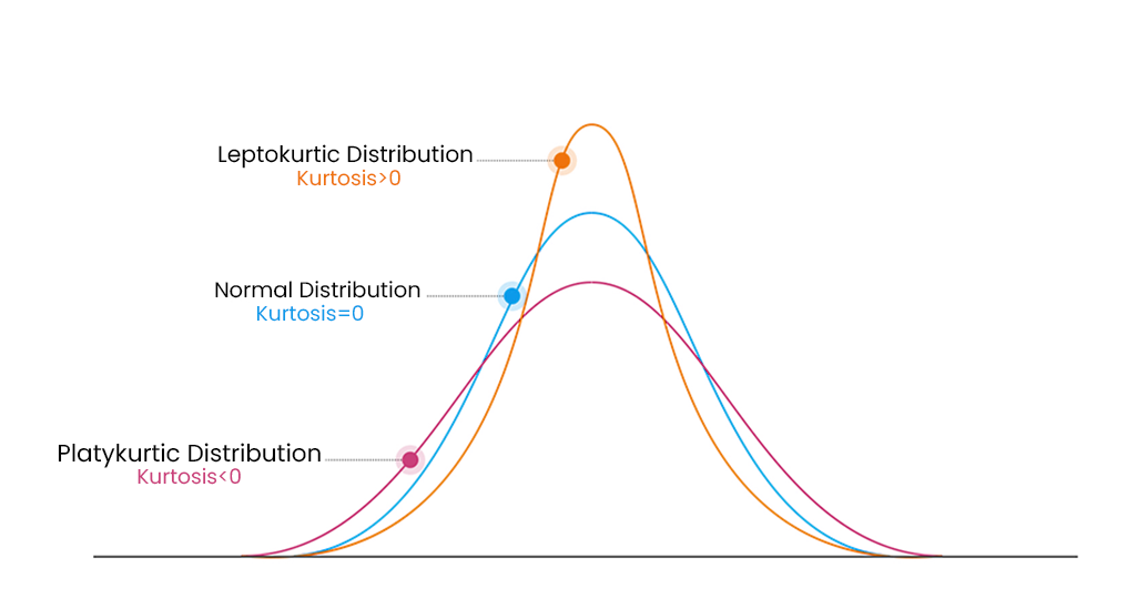
Skewness and Kurtosis
Skewness and kurtosis are two important measures of the shape of a distribution in statistics. Skewness refers to the degree of asymmetry in a distribution, or how much it deviates from a symmetrical bell curve (normal distribution). A positively skewed distribution has a long tail on the right side, while a negatively skewed distribution has a long tail on the left side.

Kurtosis, on the other hand, measures the degree of the “Tailedness” of a distribution. “Tailedness” is how often outliers occur. High kurtosis value in a data set is an indicator that data has heavy outliers, whereas, low kurtosis in a data set is an indicator that data has lack of outliers. A positive kurtosis indicates a distribution more peaked than normal and heavy tails, while a negative kurtosis indicates a flatter curve than normal, with lighter tails. These measures are useful in analyzing and comparing different data sets and can provide insights into the underlying characteristics of the data. We usually use kurtosis to check whether the tails of a given distribution have extreme values
Math expressions:
$$ \text{skewness}=\dfrac{\sum_{i=1}^N (x_i -\mu)^3}{(N-1)\sigma^3}, \quad \text{kurtosis}=\dfrac{\sum_{i=1}^N (x_i -\mu)^4}{N\sigma^4}-3$$
 # Calculate the variance of each feature column
sepal_length_skew = dataset["sepal length (cm)"].skew()
sepal_length_kurt = dataset["sepal length (cm)"].kurt()
Output:

Applications
Based on the histogram and boxplot charts shown in the previous section, we can note:
- A clear distinction between the distribution of sepal and petal features. The sepal feature distributions are closer in shape to normal, whereas the petal features histograms are closer in shape to a bimodal distribution, which is confirmed for the petal length feature.
Generally, the unusual (undefined) shaped histogram, doesn’t reveal much information about the data we have, however in the case of a classification problem, it could intel that it is due to the different classes present in the dataset. Thus, making that feature (i.e. with undefined histogram shape) very important for model training, but it is certainly requires further investigation to verify this possibility. In our case, the histograms of petal features for each class present in the dataset confirms it, as shown below.
- The sepal features are unimodal, and slightly positively skewed. The sepal width feature distribution is more clustered around the median with a positive kurtosis coefficient, making it leptokurtic. There are also few outliers that can be manually investigated to decide how to treat them.
Whereas, the sepal length feature shows a fairly opposite characteristics, being platykurtic, less clustered around the median and with no sign of outliers. For the classification problem, we can plot the histograms of the sepal features for each class to investigate whether these features hold information useful for training a classification model.We can observe a small separation between the histograms of sepal length and less separation for the sepal width feature. This informs us that, a priori, these features hold less useful information for model training than the petal features.


Up to this point, we’ve seen some examples on how to use statistics to explore data both numerically and visually. This is a crucial step in every project, since every stage that comes after depends on it, and because we cannot make sure that everything is done perfectly all the time, and iterative process is always recommended, as illustrated in the workflow chart above.
After performing and EDA for the dataset, we pass to the feature engineering step. This step is essential for model training, if we expect great performance.
Feature engineering can be summarized in 4 main categories:
- Feature creation: It involves combining existing features to create new ones that holds more information for a classification model.
- Feature Transformation: Transformations are used to manipulate predictor variables to improve model performance, accuracy, and flexibility. Moreover, they are used to avoid computational errors by ensuring all features are within an acceptable range for the model.
- Feature extraction: It is the process of automatically creating new variables by extracting them from raw data, reducing the data volume for modeling.
- Feature selection: It is the process of ranking and prioritizing useful features, while removing irrelevant and redundant ones.
Feature creation:
One important thing to note, is that despite the fact that feature engineering requires deep understanding of the data and how to manipulate it. We always have to go through a trial and error process, to be able to find the optimal set of features.
In our case, we only have 4 features in the dataset. Thus, we don’t have much to do for manual feature creation using basic statistics. However, we can always try combining features in a non-linear fashion to create new features that inherits information from the initial features used. Below, some examples of created features:
  # Create new features using the Mode and Median
dataset["f1"] = dataset["sepal length (cm)"]*dataset["petal length (cm)"]/(sepal_length_median*petal_length_median)
dataset["f2"] = dataset["sepal length (cm)"]*dataset["petal length (cm)"]/(sepal_length_mode[0]*petal_length_mode[0])
dataset["f3"] = dataset["sepal width (cm)"]*dataset["petal width (cm)"]/(sepal_width_median*petal_width_median)
dataset["f4"] = dataset["sepal width (cm)"]*dataset["petal width (cm)"]/(sepal_width_mode[0]*petal_width_mode[0])
In some cases, we can create new features that are obviously useful. For instance, in a house price prediction problem, using the width and length features of the house to create a surface feature is quite straightforward. However, this is mostly not the case, and that’s why we need trial and error process. We can use the features that we created above and train a model with and then without them. Then, by comparing the results we can decided whether they are useful or not. But, because such process is time consuming, we can use other statistical methods to check for feature importance, which we will discuss later on this article.
Feature Transformation:
Feature transformations are much more simple and obvious, since they depend on the type of ML problem, as well as the input requirements of the used model. One of the most commonly used statistical transformation techniques for classification problems is called, min-max normalization. It is performed as shown below.
dataset['sepal length (cm)'] = dataset['sepal length (cm)'] - dataset['sepal length (cm)'].min() / (sepal_length_range)We normalize data in machine learning to ensure that features or variables with different scales and units are on a level playing field. This is important because most machine learning algorithms use some form of distance metric to measure similarity between data points. Without normalization, features with larger scales dominate those with smaller scales, which can adversely affect the performance of the algorithm. The normalization process is usually considered as a data preprocessing step, as it is performed as the last transformation step before starting the model training process.
After exploring basic statistics for data preparation, it's time to delve into more intriguing concepts can be applied in all the the steps that involves statistics mentioned earlier.
Statistical Tests and Hypothesis Testing
In order for us to understand Statistical Tests and Hypothesis Testing, we need first to introduce important statistical concepts.
Normal Distribution
The normal distribution, also called the Gaussian distribution, is a symmetrical bell-shaped probability distribution. It is characterized by 2 parameters (Mean μ and standard deviation σ). The normal distribution is observed in various natural phenomena, such as IQ scores and human age, as shown below.

A special case of a normal distribution that is very used in statistics is the standard normal distribution, also known as the Z-distribution, which is characterized by: $$ \mu=0, \quad\sigma=1$$
Notations:$$ \text{Normal distribution: }N(\mu,\sigma^2)\\\text{Standard normal distribution: }Z=N(0,1)$$
A useful information about the Z-distribution is that the majority of the data falling within one standard deviation of the mean, and the figure below illustrates that.

Central Limit Theorem
The Central Limit Theorem or (CLT), states that when taking large random samples from a population with a mean of μ and a standard deviation of σ, the distribution of the means of those samples will be approximately normal, regardless of the original population's distribution. It's important to note that the theorem holds when the sample size is 30 or greater, which is a general rule of thumb.
The large number of random samples constitute what’s called a sampling distribution (SD), and the distribution of the means of the sampling distribution is then called the sampling distribution of the mean (SDx̄).
Notations:
- Sampling distribution of the mean:
$$ \text{SD}{\bar X}=N(\mu{SD_{\bar X}}, \sigma_{SD_{\bar X}}),\quad N:\text{Normal distribution} $$
- The mean of the sampling distribution:
$$ \mu_{SD_{\bar X}}=\mu $$
- The standard deviation of the sampling distribution, also called the standard error:
$$ \sigma_{SD_{\bar X}}=\frac{\sigma}{\sqrt{\text{N}}},\quad \text{N: Sample size} $$
Now that we have a clear idea about the normal distribution and the central limit theorem, we can introduce the hypothesis test concept.
Hypothesis testing
Hypothesis testing is a crucial concept in statistics that enables us to use data to make informed decisions about the validity of assumptions regarding a population. It entails creating a hypothesis and examining it using sample data, with the aim of establishing whether a result is statistically significant, i.e., unlikely to have arisen by chance. This process has broad applications in different stages of a typical machine learning project, such as feature engineering, model selection, and model evaluation.
In hypothesis testing, we make a claim and the claim is usually about population parameters such as mean, median, standard deviation, etc. The assumption we make are:
- Null Hypothesis(H0): It is the hypothesis to be tested. It is the default state that is believed to hold true unless we have evidence that suggest otherwise. e.g. There is no significant difference in the mean life span of individuals who exercise regularly and those who do not.
- Alternate Hypothesis (H1): All the other ideas contrasting the null hypothesis form the Alternate Hypothesis e.g. Individuals who exercise regularly will have a greater mean life span than those who do not.
One great example from real-life that helps clarifying the concept of hypothesis testing is the famous legal principle, called The presumption of innocence. This legal principle states that every person accused of any crime is considered innocent (H0) until proven guilty (H1).
"... the null hypothesis is never proved or established, but is possibly disproved, in the course of experimentation. Every experiment may be said to exist only to give the facts a chance of disproving the null hypothesis." -R. A. Fisher
In order to decide whether to reject the null hypothesis or retain it, we need to calculate what’s called a P-value.
P-value: It is a probability value that measures the strength of evidence against a null hypothesis. Therefore, it is a measure of how likely it is that the observed data is consistent with the null hypothesis.
“ The p-value is the probability of obtaining test results at least as extreme as the results actually observed, under the assumption that the null hypothesis is correct.” — Wikipedia
In order to determine the p-value, we need to select the appropriate Statistical Test for the hypothesis testing we’re conducting.
Statistical tests
There are many different types of statistical tests, each of which is used to answer a specific type of hypothesis. Some examples of common statistical tests include t-tests, ANOVA, correlation analysis, and regression analysis.
There are two categories of statistical tests, parametric and non-parametric tests. Briefly, the main difference between parametric and non-parametric statistical tests is that parametric tests assume that the data being analyzed respect certain assumption, such as Normality, Independence, and homogeneity of variance, while non-parametric tests make no such assumptions. Examples of parametric tests include the t-test, ANOVA, and linear regression. Whereas the non-parametric tests include the Wilcoxon signed-rank test, the Chi-square test of independence, and the Kruskal-Wallis H test.
In this paragraph, we shall introduce only the most commonly used statistical test, which are:
- z-test: It is a statistical test used to compare a sample mean to a population mean when the population standard deviation is known. we start with a null hypothesis that the sample mean is equal to the population mean, and an alternative hypothesis that the sample mean is different from the population mean. We calculate a test statistic called the z-score, which measures the number of standard deviations that the sample mean is from the population mean. The z-score can then be used to determine a p-value.
- μ0 is the population mean under H0
- σ is the population standard deviation
- N is the sample size, and x̄ is the sample mean
$$ \text{z}=\dfrac{\bar X-\mu_0}{\sigma/\sqrt{\text{N}}} $$
- t-test: It is a statistical test used to compare a sample mean to a population mean when the population standard deviation is unknown or when the sample size is small. The hypothesis used in this test are identical to those used for the z-test, and a p-value is determined using a t-score instead of a z-score.
- μ0 is the population mean under H0
- s is the population standard deviation under H0
- N is the sample size, and x̄ is the sample mean
$$ \text{t}=\dfrac{\bar X-\mu_0}{s/\sqrt{\text{N}}} $$
- Paired t-test: A paired samples t-test is used to compare the means of two samples when each observation in one sample can be paired with an observation in the other sample.
- đ is the sample mean of differences
- d0 is the population mean difference under H0
- s_d is the standard deviation of differences
- N is the sample size, and x̄ is the sample mean
$$ \text{t}=\dfrac{\bar d-d_0}{s_d/\sqrt{\text{N}}} $$
- ANOVA test: It is a statistical test used to compare the means of two or more groups or treatments to determine if there is a significant difference between them. ANOVA is used when there are multiple groups being compared, whereas a t-test is used when there are only two groups being compared.
- Pearson Correlation Test: It is a statistical test that measures the strength and direction of the linear relationship between two continuous variables. It measures the degree of association between two variables, ranging from -1 to +1, where -1 indicates a perfect negative correlation (i.e., as one variable increases, the other decreases), +1 indicates a perfect positive correlation (i.e., as one variable increases, the other also increases), and 0 indicates no correlation.
- Chi-square test of independence: it is a statistical test used to determine whether two variables are independent. It is a non-parametric test, and it is used to calculate a statistic called the chi-square statistic. This statistic is then compared to a critical value to determine whether the two variables are independent.
Note: The reason we did not mention the assumptions necessary for each parametric test is that including them would unnecessarily lengthen this paragraph. However, we will cite the assumption for the tests we will use in applications.
After having covered multiple statistical concepts, it is time to examine their practical applications in the context of machine learning. To achieve that, we will go through 3 applications, where each application targets a step among the typical machine learning workflow presented at the beginning of this article.
Applications
Normalization using z-score
Data normalization is a common pre-processing step in machine learning that involves transforming the numerical data in a dataset to have a consistent scale and distribution.
The most common normalization techniques include:
- Min-max scaling: This involves scaling each feature to a range between 0 and 1, based on the minimum and maximum values of the feature in the dataset.
- z-score normalization: This involves transforming each feature to have a mean of 0 and a standard deviation of 1.
- Log transformation: This involves taking the logarithm of each feature, which can help to reduce the influence of outliers and skewness in the data.
Application:
# Import libraries
from sklearn.preprocessing import StandardScaler

# Create a copy of the dataframe to normalize
prep_dataset = dataset.copy()

# Normalize the feature distribution
# 1st method:
for col in prep_dataset.columns[:-1]:
    prep_dataset[col] = (prep_dataset[col]-prep_dataset[col].mean())/prep_dataset[col].std()
# 2nd method:
scaler = StandardScaler()
prep_dataset = scaler.fit_transform(prep_dataset.iloc[:,:-1])
prep_dataset = pd.DataFrame(prep_dataset, columns=['sepal length (cm)','sepal width (cm)','petal length (cm)','petal width (cm)'])
prep_dataset['target']=dataset['target']
# Plot histograms to visualize the results
Output:

Model Evaluation using paired t-test
Let’s suppose we have an Iris classification model in production, and we have just finished training a new one. Naturally, we ask the question; Does the new model perform better than the existing model?
To answer this question, we need to perform hypothesis testing, the steps are as follow:
- The null hypothesis (H0) is that there is no difference in the f1-score between the new model and the existing model. The alternative hypothesis (H1) is that the new model f1-score is greater than the existing model.
- In our case, we can use a paired t-test, which is appropriate when we have two samples of paired data, in this case we have the f1-score of the new and existing models over the 15x2 cross-validation folds.
- We set a significance level (alpha) of 0.05 for the test.
- We calculate the test statistic, which is the mean difference between the two models f1-scores divided by the standard error of the difference.
- We calculate the p-value associated with the test statistic, which is the probability of obtaining a result as extreme or more extreme than the observed result, assuming the null hypothesis is true.
- If the p-value is less than the significance level (0.05 in this case), we reject the null hypothesis and conclude that the new model is significantly more accurate than the existing model.
Application:
Existing model: Decision tree
New Model: Support Vector Machine
Steps:
- Perform 15x2 cross-validation and store f1-score for both models.
Output:# Import libraries from sklearn import svm from sklearn.tree import DecisionTreeClassifier from sklearn.model_selection import KFold from sklearn.metrics import f1_score # Perform 15x2 cross-validation and store f1-scores test_f1={'Decision_tree':[], 'SVM':[]} kf = KFold(n_splits=2) # Repeating 2 folds cv 15 times with data shuffle between iterations for i in range(15): data = prep_dataset.sample(frac=1, random_state=np.random.randint(0,100)) for j, (train_index, test_index) in enumerate(kf.split(data)): X_train, X_test = data.iloc[train_index,:-1], data.iloc[test_index,:-1] y_train, y_test = data.iloc[train_index,-1], data.iloc[test_index, -1] # Training models svm_model = svm.SVC(random_state=0).fit(X_train, y_train) dt_model = DecisionTreeClassifier(random_state=0).fit(X_train, y_train) # Storing f1-scores test_f1['Decision_tree'].append(f1_score(y_test, dt_model.predict(X_test), average='macro')) test_f1['SVM'].append(f1_score(y_test, svm_model.predict(X_test), average='macro')) # Print results df_results = pd.DataFrame(test_f1, index=[f"fold_{str(i+1)}" for i in range(len(test_f1["SVM"]))]) df_results.head(10)
- Verify statistical test assumption:
The paired t-test impose 3 assumptions:
Normality: The differences between the pairs should be approximately normally distributed.
Independence: Each observation should be independent of every other observation.
No Extreme Outliers: There should be no extreme outliers in the differences. The second assumption is a given in our case, we just need to verify the first and last assumptions. We are going to verify the normality visually, but there are statistical test for that, such as the shapiro-wilk test of normality.
Output:# Verify the normality and outliers existence for the difference distribution # Import libraries import statsmodels.api as sm import pylab as py # Calculate the f1-score difference diff = df_results['SVM']-df_results['Decision_tree'] # Plot the Q-Q plot sm.qqplot(diff, line ='45', fit=True) py.show() # Plot the histogram and boxplot f, (ax_box, ax_hist) = plt.subplots(2, sharex=True, gridspec_kw={"height_ratios": (.15, .85)}) sb.boxplot(diff, ax=ax_box, orient='h') sb.histplot(diff, kde=True, bins=10) ax_box.set(yticks=[]) sb.despine(ax=ax_hist) sb.despine(ax=ax_box, left=True)It is clear that the distribution at hands is close to a normal distribution, and no extreme outliers are present.
- Calculate the test statistic and determine the p-value:
Output:# Import libraries from scipy import stats # Calculate the t statistic and the p-value # 1st method: t1 = diff.mean()/(diff.std()/np.sqrt(len(diff))) pval1 = stats.t.sf(t, df=len(diff)) # 2nd method: t2, pval2= stats.ttest_rel(df_results['SVM'], df_results['Decision_tree'], alternative='greater') # Print results print(f"1st methods:\nt statistic: {t1}, pval:{pval1}") print(f"2nd methods:\nt statistic: {t2}, pval:{pval2}")
- Draw conclusions:
Output:alpha=0.05 if pval<alpha: print("We have strong enough evidance to reject the null hypothesis!") print("Therefore, the alternative hypothesis is accepted.") else: print("We don't have strong enough evidence to reject the null hypothesis!")


By applying hypothesis testing in this way, we can say that we are 95% confident that the new model is significantly more accurate than the existing model. That’s how hypothesis testing can help us make data-driven decisions about which machine learning models are most effective and improve our overall performance.
In what follows, we will not provide step-by-step application of the statistical tests, to avoid repetition, and to make the article easier to read. So, we will only use the statistical test implemented by the different Python libraries to calculate the test statistic and the p-value. We will however explain the utility of each test used along with the required assumptions if there are any.
Feature selection using statistical tests
In machine learning, there are numerous feature selection methods used to reduce the number of feature present in the dataset. The filter methods helps reduce the number of features by selecting the most important ones. There are also multiple filter methods and we should use the method that is suitable for the task we have, and for that we have the following diagram.

In our case, we have a classification problem with numerical input features and a categorical target variable. Therefore, we can use the ANOVA test for feature selection. Although, we only have 4 features in this dataset, which is not the usual case when dealing with real ML problems, we will show how it’s done in Python.
Application:
Using the ANOVA test, we will select 2 features from the 4 features present in the dataset. To calculate the test statistic and the p-value we will use the f_classif() function by scikit-learn as well as the SelectKBest() class to calculate the F-statistic and p-value for each input variable with the target.
- Perform 15x2 cross-validation and store f1-score for both models:
Output:# Import libraries from sklearn.feature_selection import SelectKBest from sklearn.feature_selection import f_classif # Perform feature selection using ANOVA fs = SelectKBest(score_func=f_classif, k=2) X_selected = fs.fit_transform(prep_dataset.iloc[:,:-1], prep_dataset.iloc[:,-1]) # Let's check which features where selected selected_cols=[] for col in prep_dataset.columns: if sum(prep_dataset[col]==X_selected[:,0])==150 or sum(prep_dataset[col]==X_selected[:,1])==150 : selected_cols.append(col) print("The selected features are", selected_cols)This confirms the observation that we made earlier about the petal features being more useful for the classification of Irises.
In this section, we’ve presented few aspects of using statistical concepts in the context of a machine learning project. Now, you can utilize what you’ve learned in the different stages of your machine learning project. In the last paragraph below, I will present some tips of using statistics to better communicate the results of your work.
Note about sampling: Although sampling methods are a crucial part of the statistical methods employed in machine learning, I have chosen to exclude them from this article intentionally. The reason behind this is that I plan to write a detailed article on sampling methods separately. If I were to cover them here, it would unnecessarily lengthen this article.
About Communicating results
Communicating the results of a machine learning problem can be challenging, as it often involves complex statistical models and machine learning algorithms. Here are some tips on how to use statistics to effectively communicate the results of a machine learning problem:
- Provide context: Make sure to provide context for your machine learning results. Explain the business problem that you're trying to solve, the methods that you used, and the limitations of your analysis. Support your ideas and claims with statistics. This will help your audience understand the significance of your results and how they fit into the broader context of your work.
- Explain the model: It's important to explain the model that you used to solve the machine learning problem. Describe the inputs, the outputs, and the overall structure of the model. Explain any pre-processing or feature engineering steps that you took, and describe the hyperparameters that you used to train the model.
- Choose appropriate evaluation metrics: When evaluating a machine learning model, it's important to choose appropriate evaluation metrics that are relevant to the problem you're trying to solve. For example, if you're working on a binary classification problem, you might use metrics such as accuracy, precision, recall, and F1 score to evaluate your model, as we’ve seen in the examples above.
- Use data visualization: Visual aids such as confusion matrices, ROC curves, and precision-recall curves can help illustrate the performance of your machine learning model. Use these visual aids to help explain the trade-offs between different evaluation metrics and to demonstrate how well your model is performing.
- Interpret the results: Interpret the results of your machine learning model in a way that is meaningful to your audience. Explain the implications of the model's performance, and describe how the results can be used to inform business decisions or other practical applications.
Overall, the key to effectively communicating the results of a machine learning problem is to use statistics in a way that is accessible and meaningful to your audience.
In conclusion, statistics plays a crucial role in the development and evaluation of machine learning models. By using statistical methods and techniques, we can identify patterns and relationships in our data that can inform the creation of new features and the selection of appropriate models. However, it's important to remember that statistics is just one tool in your machine learning toolbox, and that the best results often come from a combination of statistical methods, domain knowledge, and creative problem-solving. By using statistics effectively and in conjunction with other techniques, you can unlock the full potential of machine learning and achieve better results for a wide range of applications.


